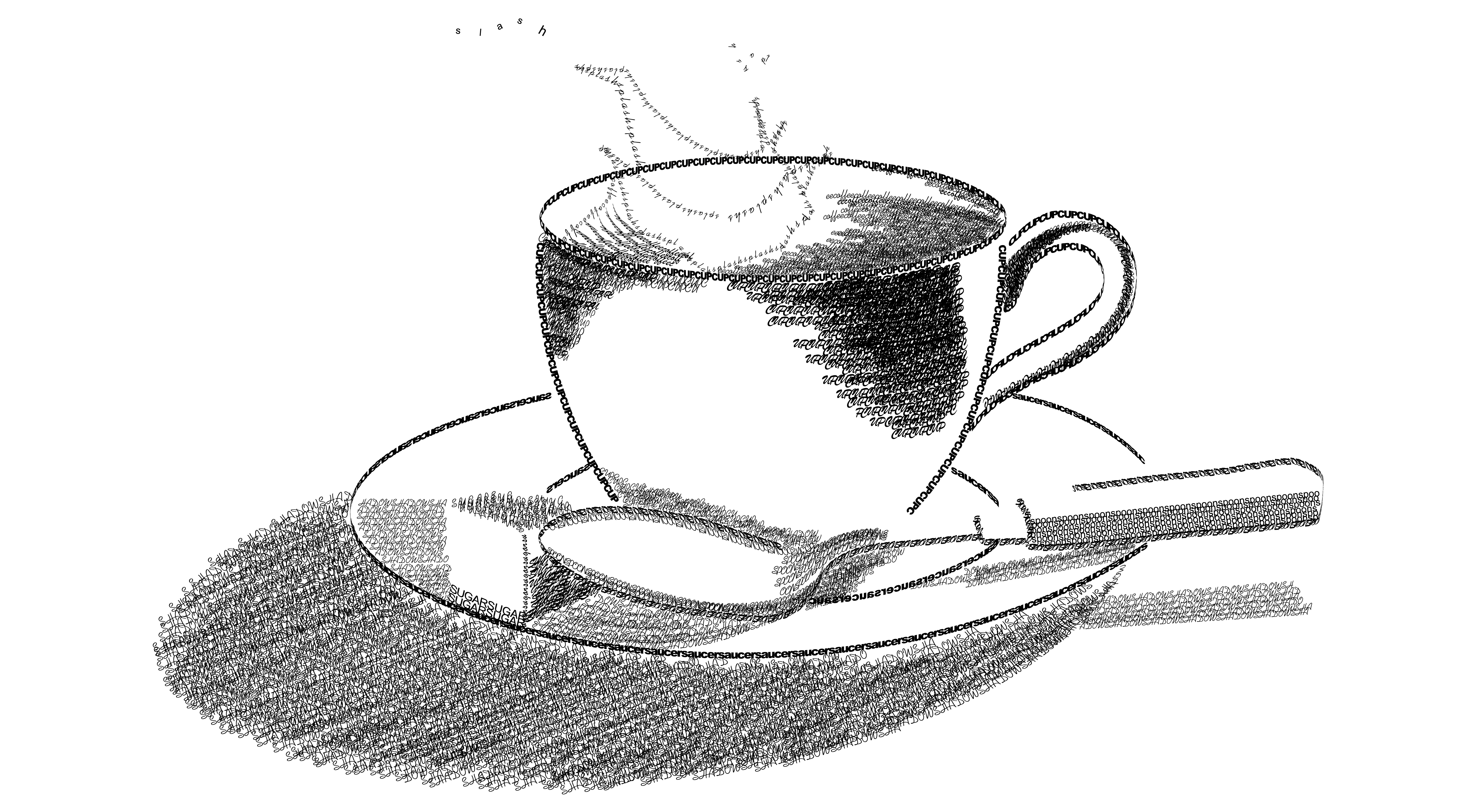
Typography Study
A typography-focused composition exploring hierarchy, spacing, and visual rhythm. I used contrast and alignment to guide the eye while keeping the layout balanced and readable—showcasing strong fundamentals in type, structure, and visual communication.
Design Notes
- Value + shading built with hatch-style strokes to create depth and form.
- Clean contour lines to define the cup, saucer, and spoon with simple, readable silhouettes.
- Light direction consistency so highlights/shadows feel realistic and balanced.
- Composition + negative space to keep the focal point clear and the layout calm.
- Texture as emphasis (grain/hatching) to add mood without distracting from the subject.
Typography & UX/UI Principles Applied
- Visual Hierarchy: Scale, spacing, and contrast are used to establish a clear reading order, guiding the viewer's eye through the layout.
- Legibility and Readability: Type spacing and clean contours ensure text and forms remain easy to distinguish at different viewing distances.
- Cognitive Load Reduction: By limiting decorative complexity and emphasizing structure, the design reduces unnecessary visual noise.
- Gestalt Principles: Proximity and alignment group related elements, allowing users to intuitively understand structure and relationships.
- Balance and Visual Rhythm: Repetition of spacing and form creates rhythm, supporting smooth eye movement across the composition.
- Hierarchical shading: Value transitions are used to create depth cues, allowing the cup to read as a dimensional object rather than a flat graphic.
The hierarchical shading in the poster creates a subtle three-dimensional effect. By controlling value transitions and light direction, the design gives the viewer a sense of depth, allowing the flat layout to feel more volumetric and physically present.
This project demonstrates how traditional graphic design techniques can be applied intentionally to UX/UI design, where typography and layout support clarity, usability, and effective communication.